Optimize Your E-Commerce Checkout Flow

This comprehensive guide to optimizing checkout UX is guaranteed to help you boost sales and conversions. Read this to get our tried and true e-commerce checkout tips!
Why Clients Quit E-Commerce Checkouts
Understand Shopping Cart Basics
Nail the Checkout UX
Avoid Checkout Surprises
Closing Thoughts
Twitter
Facebook
LinkedIn
Part 1
Part Why Clients Quit E-Commerce Checkouts
You’ve got your products. You’ve designed and built your site. Whether you’re a JAMstack or a WordPress enthusiast, it doesn’t matter. Your e-commerce store is officially up and running. Congrats! Plus, your traffic is growing—fast. But before you’ve had time to pop the champagne, reality hits you with some terrifying math:
High traffic + Low sales = No champagne.
People are visiting your site, but no one is going through with purchase. And it’s driving you insane. Well fear not, lucky reader, and feel free to pop that champagne after all. You may just be dealing with some bad e-commerce checkout practices. Don’t worry, you’re not alone.
In fact, many merchants take the “If I build it, they will come” approach; they’ve never even considered how to design an e-commerce checkout flow that converts. But we have. That’s why, in this article, we’re going to give you 5 actionable tips to make sure that your checkout flow is getting you the conversions you deserve.
But first, a small story...
I’m at the grocery store to buy a pack of gum and, of course, there’s only one check-out line open. Plus, the cashier is slower than season 4 of the Walking Dead. To top it off, the person in front of me wants to use an expired coupon to save 20 cents on cat food. Now, this:
Credit card declined. “Try again?”
Credit card declined. “Maybe one more time?”
Credit card declined. “Ok… I’ll just pay in quarters.”


All the while I’m standing there like an idiot holding the one thing I wanted. But here’s the strange part:
I don’t leave. I stay through all those little frustrations to get my stupid pack of gum.
Why? Because I’ve invested too much time and effort just getting to the store. It’d be more annoying to come back later than it would be to just wait it out.
But shopping online? That’s a totally different story.
Shopping brick and mortar takes time and patience; shopping online doesn’t. So the second your client has even the slightest inconvenience during checkout, guess what?
Poof. They’re gone. Vanished into that thin digital air.
Cart abandonment is one of the largest problems facing the e-commerce world. In fact, it costs merchants roughly 2-4 trillion dollars per year.
Let that sink in. 2 - 4 trillion dollars per year.
With stakes so high, optimizing your e-commerce checkout UX is critical. It’s part of your job as a developer to equip your clients with conversion-focused shopping carts and checkouts. Knowing how to code is half the battle, sure. But, knowing what to code is what will separate the pro’s from the newbs.
That said, let’s not get ahead of ourselves. Before we dive into how to improve UX by optimizing your checkout flow, try to remember one very crucial point:
Some things are just out of your control.
Well, more specifically, two things are out of your control.
1) Window shoppers

The unfortunate reality of e-commerce is that people don’t always shop to buy. Much like traditional “window shopping,” online customers are Windows shopping (horrible joke, I know, but you get the point).
Some people just want to browse, compare prices, and store items in their shopping cart for future reference. All without the slightest intention of checking out.
Sadly you can’t do much about that—even though all those people ‘just looking’ make up a large portion of cart abandonment. Stats are a bit conflicted how much, though. Some put it as low as 40%, though the reliable Baymard Institute puts it at 58.6%. Either way, it’s still a substantial amount.
2) Merchant constraints including shipping and payment methods
Apart from consumers, you also have to respect the seller’s operation. Even if you design the most beautiful checkout experience on the planet but the merchant only accepts Amex and/or has high shipping rates, customers will likely leave their cart to the digital wolves. The more limitations your merchant has, the more limitations you have.
OK. Now for the good news: all the other variables are entirely in your control. So let’s dive right into the best practices for checkout optimization
Part 2
Understand Shopping Cart Basics

We’ll start at the most basic level possible: the cart.
Your shopping cart needs to have the following three elements shown in a clear, organized way:
Product Inventory (with pictures/descriptions)
Product Quantity
Product Options

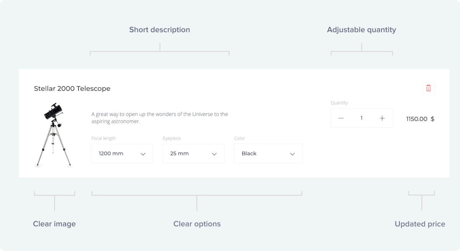
Your customer should be able to see all of these things immediately after opening their cart. But just having that information isn’t enough if you want to maximize your UX. Your clients also need to be able to edit their cart with zero difficulties.
People change their minds all the time. One minute they want socks and the next? Well, now they’re all about sandals.
So no matter what mood your customer is in, you need to let your clients add/remove products, adjust how much of any one item they want, and change the size/color according to their heart’s desire.
This is critical.
Giving your user the ability to modify their cart builds trust and, in turn, results in higher sales. Just think about it:
If your client can’t easily remove products they don’t want, you look shady.
If your client can’t easily add a new product or change quantity/size/color, you look incompetent.
If they can’t easily do any of that, you look like a shady incompetent.
In any case, no one wants to do business with either (or both), so you’re losing money.
Oh, and here’s a quick (but major) design and accessibility tip: support people who are color blind! Here are some cool resources:
A quick word on optimizing for mobile checkout
Hands down if you take anything away from this article, make it this:
Your shopping cart needs to work seamlessly on mobile devices.
This advice has transitioned from “a nice UX luxury” to absolutely foundational. If your site isn’t optimized for mobile, you’re shooting yourself in the foot and just asking customers to abandon their cart. Here’s why:
In the past few years, the ratio of desktop and mobile use for e-commerce has changed a ton. As of right now, nearly half of all online shopping is done from smartphones or tablets. Now this doesn’t mean that shopping from a desktop has gone down (it hasn’t), but it does mean that the amount of people browsing e-commerce sites from their phones has skyrocketed.
This can be a double-edged sword for you. On the one hand, it’s great. It means that more people are engaging with and potentially buying from online stores. So that’s awesome.
But on the flip side...
...the rate of cart abandonment from mobiles is high. Like, really high. Like 85% high. Compare this with the 73% cart abandonment rate from desktops and you see why it’s worth investing in your site’s mobile checkout process. In fact, your mobile checkout should run just as smoothly as—if not better than—your desktop’s checkout.
There are some good articles on how to go about this, but you’ll notice the main difference is text and button size. Thumbs and index fingers are typically less precise than a mouse, so you want to accommodate for that. For more helpful tips on how to optimize your mobile checkout flow, check out the following articles:
Part 3
Nail the Checkout UX

Whether your customers are shopping from their desktop or from their phone you need to make things as simple for them as possible.
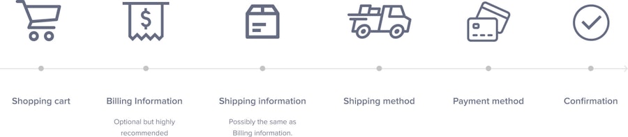
The standard checkout flow goes like this:
Shopping Cart (contents)
Billing Information (optional: depends on the merchant)
Shipping Information (possibly the same as Billing Information)
Shipping Method
Payment Method
Confirmation

However, this really depends on the type of product you’re selling. In the 21st century, it’s not uncommon to sell digital products (SaaS, online subscriptions, etc.), rather than physical ones (t-shirts, hardware, etc.). If you’re selling digital products, congrats! You can cut a ton of the fat off your checkout flow limiting your flow to the following sections:
Shopping Cart (contents)
Billing information (optional: depends on the merchant)
Payment Method
Confirmation
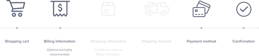
Because nothing needs to be shipped, you don’t need shipping information or method sections.
It’s worth noting that including Billing Information depends on the merchant for both physical and digital products. Merchants will need to decide whether or not they want to activate the Address Verification Service (AVS) through their online payment gateway. Most gateways allow merchants to turn AVS on or off at their own discretion. However, some online payment gateways offer incentives to merchants (like lower processing fees) for leaving AVS turned on because it lowers the risk of fraud. As the developer, you need to consult with the merchant to see if they will have AVS activated. If yes, then include a Billing Information section in your checkout flow; if not, then cut Billing Information altogether.
Editor's note: Asking for billing information has now become the norm. For the purposes of this article, it will be assumed that the merchant will be entering billing information for digital or physical products.
Where this becomes more relevant to you as the developer, however, is when the merchant asks for both Billing and Shipping Information (the merchant activates AVS and sells a physical product that will be shipped). Because Billing and Shipping Information is typically the same, you can simplify your checkout flow by letting customers indicate that a different address will be used for both fields, if necessary. That can be done with a simple click of a button, like so:

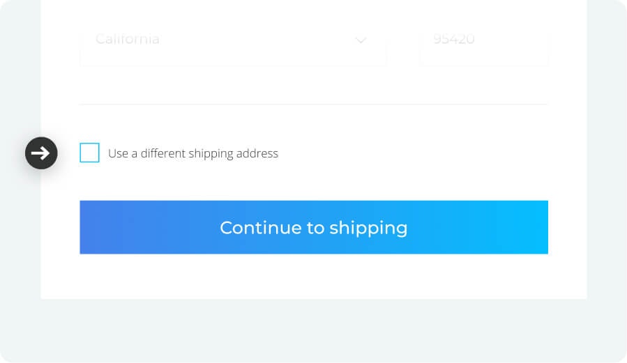
Typically, Shipping and Billing information is the same. However, this is not always the case which is why you need to leave the option to change the shipping address. How should you know whether or not you should assume Billing and Shipping Information are the same by default?
It depends on your merchant’s needs, but here’s a fairly simple rule:
Products that people buy for themselves: assume Billing and Shipping are the same (leave the box unclicked by default like in the image above)
Products that people buy as gifts: assume Billing and Shipping are different (have the box clicked by default unlike in the image above)
Again, it really depends on the merchant and the product. If you’re selling things that people buy for themselves like clothes, for example, then you should assume that Shipping and Billing Information is the same.
If you’re selling products that are typically gifts for others like flowers or personalized/engraved items, then you should assume that Shipping and Billing Information is not the same. This is something that you will need to consult with the merchant as they would know best.
So, if you’re selling physical products, you will always have a minimum of five sections in your checkout flow (listed above). For digital products, it would be a minimum of 3 sections (listed above). Once you have determined how many sections the merchant requires, it’s time to simplify the fields in each section as much as possible.
The goal is to walk your client by the hand smoothly toward payment without any surprises along the way. Luckily for you, it’s a pretty straightforward process. Here there are five things that you’ll want to keep in mind to make a simple, user-friendly e-commerce checkout flow.
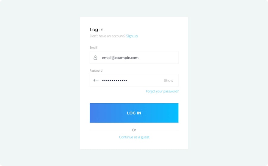
Let’s start out at the most basic level: should you require clients to register an account with you in order to checkout? (spoiler alert: Nope.)
Give the option to check out as a guest
I’ll be the first to admit that if I’m ready to pay for something—and even excited to do so—but then I’m asked to register an account… I’m out. It’s such a buzzkill. It may seem ridiculous, but it’s like the classic kid’s book, “If You Give a Mouse a Cookie.”
My money is your cookie. Don’t ask me for more. It just seems greedy.
In some cases, like with SaaS products, I get it. I’ll need an account for using the hosted product. But for ordering an item that will be physically shipped to my door, it’s a major turn-off.
And I’m not alone. 23% of transactions were abandoned because people felt exactly the same. So rather than losing 4th customer, why not give them the option of checking out as a guest?

But even if your clients don’t need to register an account to proceed with checkout, you’ll still need some basic information from them for payment and shipping. This is where some merchants tend to go off the rails.
Don’t ask for too much or unnecessary information
Your customer isn’t undergoing major surgery. They just want to pay for their products and get out.
In short, lose the paperwork… or at least as much as you can.
Sure, some fields are necessary like address and email. You use those things at a practical level to deliver the product and send confirmations/shipping updates. But ask yourself, “What information do I really need to have?”
For example, do you need their company name? What the hell is a “street address 2” anyway? And, seriously, will getting their phone number do anything other than inspire a healthy fear of telemarketers?

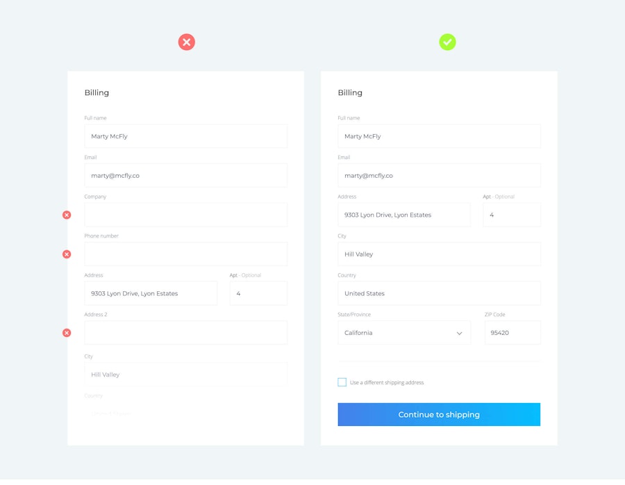
Probably not. So just leave it out.
But there’s another part to all this that some devs forget. Creepy as it might be, chances are you already have lots of information regarding your customer.
For example, if they aren’t checking out as a guest (like we talked about above) and already have an account with you, then you already know their:
First and last name
Address
Phone number
Why not capitalize on all that precious information? And no, I don’t mean going all Zuckerberg and selling your client’s data. I mean why not use what you have to make a way better UX. In other words, pre-fill all the fields with the information that you already have!
Ok, but what if they don’t have an account with you—what can you do then? Fortunately, there’s still lots of existing information you can use to make their lives easier:
In the initial “Address” field, use Google Autofill or a similar feature to autocomplete their full address.
If Autofill doesn’t work (or if you just don’t want to use it) you can pre-populate City, State, and Country in the expanded Address fields. This information comes from either related address fields that have already been input or IP/browser cached info.
If none of the above work, use their IP address or previously entered information to change labels, masks, and placeholders in your fields.
For instance, if you know a user is shopping in France then you know there will be a 5 number postal code, not a ZIP code. An address placeholder could be something like Cour Napoléon et Pyramide du Louvre, 75001 Paris, France
Mind the local differences by displaying localized currency! Prioritize (show first) fitting shipping methods according to location.
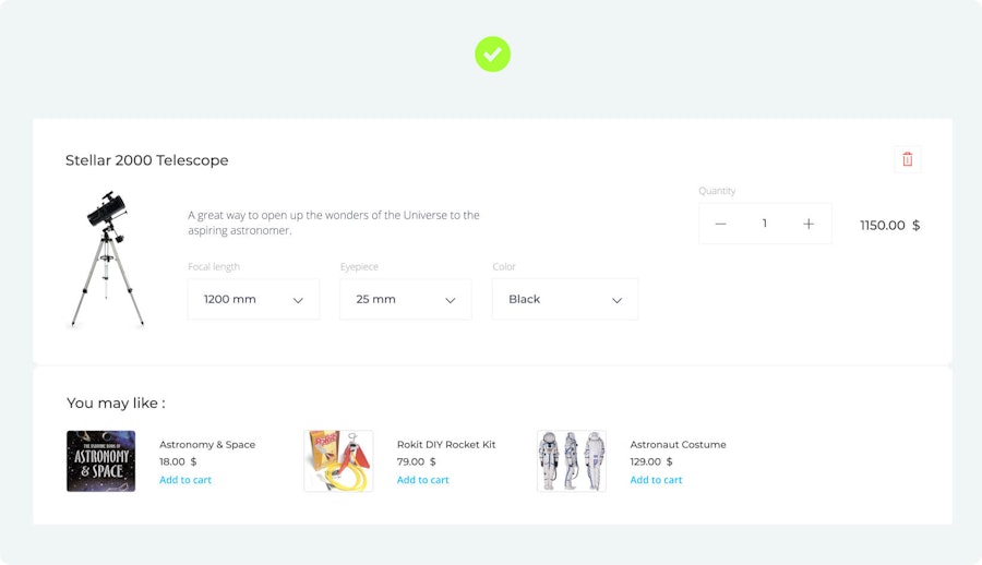
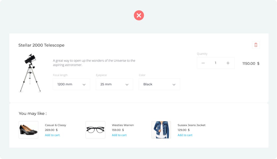
Get rid of the clutter
A lot of e-commerce sites incorporate relevant product suggestions in the shopping cart. Ok, you’re profiting from sponsors or making some cool last-minute upsells. Fair enough. But be warned: If done too much you can kill your checkout UX and ultimately lose them altogether.
Why? Because online shoppers have “e-commerce ADD.”
At this point, you want your customer focused on one thing: paying for the things they’re sure they want. That’s why it’s important that you keep their attention on following your checkout funnel rather than tempting their interest with something unrelated.
Related product suggestions can be great for upsells, but those products actually need to be relevant to be effective. And don’t get me wrong; they can be effective. All I’m saying is that if I’m shopping for a new pair of shoes and I get hit with suggestions for a crossbow, I’ll get confused (and also really interested in crossbows).
Basically, having ads or related product suggestions at checkout can distract your client enough to lead them off your page. Once gone, it’s a coin toss as to whether or not they’ll come back.


Nail the “flow”—streamline checkout UX!
The sad truth is that even if they aren’t consciously aware of it, your customers are looking for any and every reason to leave their cart before payment. That’s why it’s your job to design a checkout flow that is as user-friendly as possible. Always keep the following in mind:
You should automatically keep your clients focused on the next required step when their current field input is validated. This flowing process will lead them effortlessly toward payment.
You should NEVER ask clients to identify or input their credit card type. Seriously, it’s 2018—we have the technology to automatically differentiate between Visa and Mastercard.
Use a single-column layout. There are two benefits to single-column layouts. First, it’ll be easier to have a mobile-first design this way. Single column layouts work much better on smaller screens, so it’s less work for you in the long run.
Second, our eyes naturally scan from top to bottom of a single line. If you have 2 or 3 columns, your customer’s eyes will start jumping all over the place, thus increasing completion time and user cognitive load.
Use visual constraints! Ask yourself, “can some fields be shortened or merged together?” For instance, a “ZIP” field shouldn’t be as long as an “Address” field. These design hints will help your users better understand what’s expected of them.
Never hide field labels—either transition them out of the input field once the user starts typing or better yet, keep them out of the input field altogether. Here’s what we mean:
The main rule here is not to hide the labels while your client is answering, so they don’t lose track of what they are meant to input.
Use masks instead of placeholders when possible (E.g.: the date: DD/MM/YYYY, phone number +1 (__), exp. date: MM / YY). This is particularly true when asking customers to input numbers into fields.
Rather than telling your customers which fields are mandatory, let them know which ones are optional.
Use inline validation with real-time feedback immediately after your customer inputs their information. This can be done with a little green checkmark that lets users know they’ve filled out the field correctly.
But let’s be clear here: Inline validation is used immediately after answering the field. Not before, not during, but immediately after answering field.
Use input constraints for each field. For instance: don’t allow letters to be entered in phone number fields!
Be clear in your error messages—what did the user do wrong and what corrected information do they need to input? For example, if you’re customer enters their name in the field labeled “E-mail,” have an error message that specifically tells them they have not entered a valid e-mail address.
All of the above are following Don’t Make Me Think principles. Again, the idea being that you want to take away as much mental effort for your client as possible.
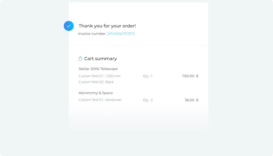
Include order confirmation after purchase
Remember being in grade school and writing notes to whomever you had a crush on that week? “Do you like me? Yes, No, or Maybe?” There was one response that was worse than “No.”
Not getting a response at all.
Once a customer has given you their personal information, they should know exactly how their order stands. Write a ‘thank you’/confirmation note that clearly informs them how they’ll receive their order summary and any further information they may need concerning their product.
Putting in a confirmation message after the order is complete is that rich chocolate icing on the checkout cake. No, it may not specifically relate to initial cart abandonment (I mean… they already paid, right?), but it will have a direct impact on returning customers/limiting refund requests. But, honestly, at the end of the day, it’s just a nice thing to do for your customers.

Alright, that’s a lot to take in. We know. But these five tips are absolutely crucial if you want to make sure you're not keeping as many satisfied clients as possible.
Part 4
Avoid Checkout Surprises
It’s official. I can’t buy plane tickets without getting red-in-the-face pissed off. Every time I think I’m getting the deal of the century, my airline throws in a bunch of hidden fees at the very last minute. Checking a bag? $45. Want a bit of extra legroom? $50. Insurance for changes? $25. The list goes on until suddenly my $200 flight has somehow doubled.
It shouldn’t be this complicated.
People want to know upfront how much things cost. So tell them. And if the saying “time=money” is true (which it is), they also want to know how long they’ll have to wait for something. So tell them that, too. These two little concepts are a big reason why Uber crushed taxis in the transport market.
The bottom line is that you need to manage and meet your customers’ expectations.
For the e-commerce world, this means remembering to include three things in your checkout flow as early as possible:
Promo Codes
Taxes
Shipping costs/Shipping ETA’s
Available payment options
Security of site clearly displayed
Promo codes
Most carts offer to enter a Promo Code before shipping or tax even come up, so it’s a good place to start. There’s a debate in the geek-marketing world as to whether or not you should make the Promo Code an open field, make the promo code a link that opens the field in the page, or just scrap it altogether.
The fear is that if your Promo field draws too much attention, your clients may leave to find the code, lose their trail of breadcrumbs in the process, and never come back.

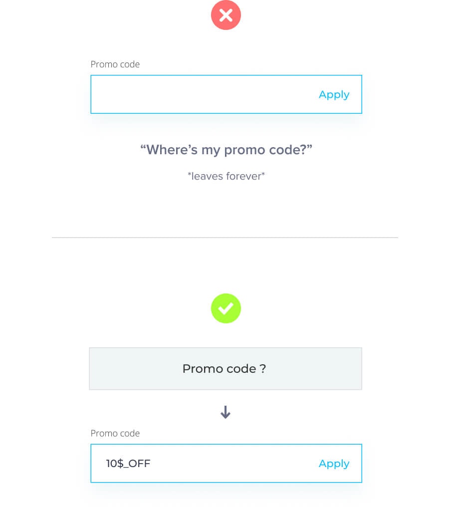
It’s a fair concern, but I tend to agree most with Jeff Dearing from SalesForce who thinks that it really depends on your company. In other words, your approach to a Promo Code will change on how frequently a merchant runs promotions. In a nutshell, here is what Dearing suggests:
If you’re a highly promotional company, emphasize Promo Codes with an open field; if you’re a semi-promotional company, de-emphasize Promo Codes with a link that will open the field; if you are a non-promotional company, consider doing away with the field altogether.
I think that’s pretty sound advice, but something each merchant needs to decide for themselves.
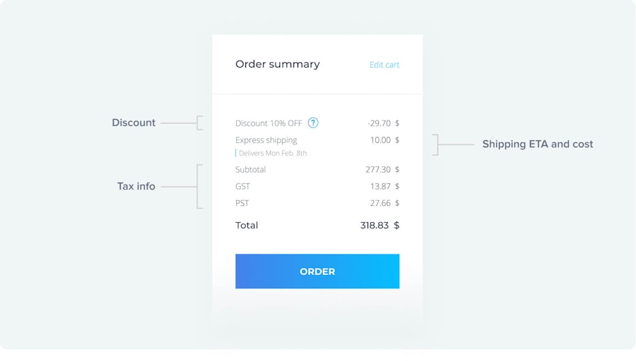
Note: If discounts or Promo Codes are applied to the initial subtotal in your client’s shopping cart (the subtotal that does not include taxes or shipping rates), you must inform customers that the new discounted price may still be affected by taxes at the end of the checkout process.
Now that we’ve covered Promos, let’s move on to one of the two guarantees in life: taxes.
Taxes
While some stores provide a “tax calculator” before the final payment page, most don’t. People expect the price to be affected by taxes. However, it’s a good idea to simply remind your customers that the initial subtotal on their cart doesn’t include costs from taxes or shipping.
Shipping costs/Shipping ETA’s
The real killer here is shipping. If you’re offering different shipping services (standard, express, next day, etc.), you need to let your customers know a) how much it will cost and b) the approximate time it will take to reach them.
The last thing you want is for your customer to be surprised by the final cost or be unsure how long they will be waiting for their products. More often than not, they’ll just abandon the cart and keep looking until they find a price/waiting time closer to what they had initially expected.

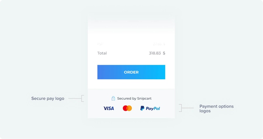
Show all of your payment options at checkout
My grandpa likes to remind me that in the ‘good ol’ days’ things were different: Beer cost a nickel. You had to walk to school barefoot in the snow (uphill both ways). And you paid for everything in cold hard cash.
In return, I like to remind him: You’re super old, grandpa.
With modern e-commerce, things have changed. Visa and Mastercard are far from the only payment options, and customers like to know what you have available. Do you take PayPal? Apple Pay? Bitpay?
In other words, what are their options for payment so they can choose what is best for them.
Show them their options by adding the payment methods’ logo directly on the shopping cart. This comes with an added bonus. Because most payment methods are seen as highly secure and trustworthy, you’ll be increasing your own brand’s street cred’ just by associating with them.
Show customers that your site (and their payment) is secure
You need to respect the fact that you’re asking someone for their money before they’re physically getting what they ordered. This type of transaction is completely unique to the online world (except for maybe drug deals?).
When shopping for physical commerce (retail, grocery stores, etc.), you have the items tangibly with you, the merchant scans them, and then you pay. But the products are always right there in front of both you and the merchant.
There’s no need for trust from either party because everything is done together.
In restaurants, it’s the exact opposite business model. You order, you literally destroy the product in front of the merchant (by eating it), and then you pay.
The merchant is placing all their trust in you to pay.
But in the online world, things are different. Your customer sees something they want, pays, and then waits for you to deliver the goods.
Your customer is placing their trust entirely in you.
That can be a super vulnerable feeling. Especially since we’ve all heard horror stories of identity theft, information dissemination, or countless others from buying things online.
The very first thing you want to do is make sure your site has its SSL certificate. You can check this simply by looking at your URL. If it starts with “https” then you’re all set; if it is just “http” then you’ll need to set up SSL on your website.

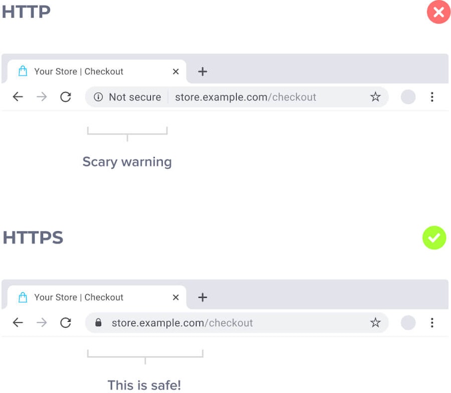
Some people have questioned whether it’s actually crucial to be SSL certified. Let me clear that up real quick: Yes.
Just yes.
And if you want to understand more about why HTTPS encryption is so important, check out Faith Ozkosemen and Vincent Courson’s in-depth discussion on the subject with Google AdSense.
Second, you’ll want to let your clients know that their payment information is confidential and the payment method is secure. As mentioned above, people already trust most major payment gateways. That said, it never hurts to add some form of visual “secure payment” logo at checkout.
And if you really want to go the distance for your customers (which you do, of course) you can add a link that lets curious users read a more in-depth explanation of how security is handled.

Part 5
Closing Thoughts
I hope this article clarified the larger do’s and don’ts of your e-commerce checkout flow. The goal is to make the whole process as intuitive as possible to increase customer UX and, in turn, lead to higher sales/conversion for you.
And that’s one win-win I think we can all raise a glass of champagne too.
To see a demo of our v3 cart (and what we think every cart should have at a basic level), check out the following video:

You can also download our free cart audit checklist here to make sure your cart is as lean and profitable as possible!
If you've enjoyed this post, please take a second to share it on Twitter.


