Creating Vue.js Transitions & Animation: Live Examples
In a rush? Skip to tutorial & live demo.
My last two projects hurled me into the JAMstack.
SPAs, headless content management, static generation... you name it.
More importantly, they gave me the opportunity to learn Vue.js. And I don't mean "Build a To-Do App" Vue.js. I mean shipping real-life, production-ready Vue apps, including killer blogs & online stores.
These two apps were my last projects for Spektrum. I then transitioned from our mother agency to Snipcart full-time. Like my predecessors, I was quickly invited to contribute to the blog.
We decided I'd start by sharing what I've learned working with Vue. Since that's a whole chunk of stuff, we'll make this an ongoing series! :)
Part 1? Handling Vue.js transitions & animations.
I've prepared live demos on CodePen, code snippets, and an open source GitHub repo for you guys.
So let's get into it!
Vue.js "transformations"—context


Disclaimer: this post digs into Vue.js and the tools it offers with its transition system. It is assumed that you are already comfortable with the basics of Vue.js and CSS transitions. For the sake of brevity and clarity, we won't get into the "logic" used in the demo.
Animations & transitions. They're the final layer, the proverbial cherry on top, that brings your website or web-app to life and entices users to explore. Animations and transitions are an integral part of UX & UI design. They are, however, so very easy to get wrong. In complex situations like dealing with lists, they can be nearly impossible to reason about when relying on native JavaScript and CSS. Whenever I ask backend developers why they dislike the frontend so vehemently, their response is usually somewhere along the lines of "... animations".
Even for those of us who are drawn to the field by an urge to create intricate micro-interactions and smooth page transitions, it quickly becomes difficult to reason about our work, given the need to rely on CSS for performance purposes.
This is where frameworks like Vue.js step in, taking the guess-work and clumsy chains of setTimeout functions out of transitions. There are already countless articles out there that outline basic usage patterns, but few that show you how to use them together in the real world. In this post, I will dive into implementations of Vue's transition and animation tools that could easily be used in your future projects.
Transitions vs. animations: key differences

Before we get started, I'd like to clear something up.
The terms transitions and animations are often used interchangeably but are not, in my experience, one and the same:
A
transitionis a simple change in the style properties on an element to be transitioned in a single step. They are often handled purely through CSS.An
animationis a more complex, usually multi-step and sometimes continuous change in appearance. Animations will often call on JavaScript to pick up where CSS' lack of logic drops off. It could be to add a class and trigger the animation or to make complex state transitions that reflect onto the DOM.
It is an important distinction when stepping into the world of Vue because both have very different approaches and toolboxes.
Using Vue.js animations & transitions in production

A rough overview of Vue transformations on Spektrum's site
1. Transitions
See the Pen VueJS transition & transition-group demo by Nicolas Udy (@udyux) on CodePen.
The simplest way to achieve transition effects on your page is through Vue's <transition> component. It makes things so simple, it almost feels like cheating. Vue will detect if any CSS animations or transitions are being used and will automatically toggle classes on the transitioned content, allowing for a perfectly timed transition system and complete control.
First step is to identify our scope. We tell Vue to prepend the transition classes with modal, for example, by setting the component's name attribute. Then to trigger a transition all you need to do is toggle the content's visibility using the v-if or v-show attributes. Vue will add/remove the classes accordingly.
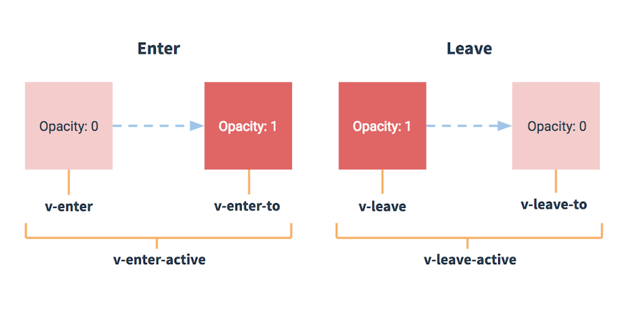
There are two "directions," enter and leave transitions. The former is used when the element is going from hidden to visible and, naturally, the latter is for the other way around.
Vue then provides 3 "hooks" that represent different timeframes in the transition:
.tray-enter-active / .tray-leave-active: These will be present throughout the entire transition and should be used to apply your CSStransitiondeclaration. You can also declare styles that need to be applied from beginning to end..tray-enter / .tray-leave: Use these classes to define how your element looks before it starts the transition..tray-enter-to / .tray-leave-to: You've probably already guessed, these determine the styles you wish to transition towards, the "complete" state.
To visualize the whole process, take a look at this chart from Vue's documentation:

So how does this translate into code? Say we simply want to fade in and out, putting the pieces together would look like this:
<transition name="modal">
    <div v-if="showFilters" class="filters">
        <!-- ... -->
    </div>
</transition>
.tray-enter,
.tray-leave-to { opacity: 0 }
.tray-leave,
.tray-enter-to { opacity: 1 }
.tray-enter-active,
.tray-leave-active { transition: opacity 300ms }This is likely the most basic implementation you will come across. Keep in mind that this transition system can also handle content changes. For example, you could react to a change in Vue's dynamic <component>.
<transition name="slide">
    <component :is="selectedView" :key="selectedView"/>
</transition>
.enter { transform: translateX(100%) }
.enter-to { transform: translateX(0) }
.slide-enter-active { position: absolute }
.leave { transform: translateX(0) }
.leave-to { transform: translateX(-100%) }
.slide-enter-active,
.slide-leave-active { transition: all 750ms ease-in-out }Whenever the selectedView changes, the old component will slide out to the left and the new one will enter from the right!
1.1 Lists
https://www.datocms-assets.com/48401/1627660978-vue-list-blog-posts.webm
Things get interesting when we start dealing with lists. Be it some bullet points or a grid of blog posts, Vue gives you the <transition-group> component.
It is worth noting here that, while the <transition> component doesn't actually render an element, this one does. The default behaviour is to use a <span> but you can override this by setting the tag attribute on the transition-group.
The other gotcha is that all list items need to have a unique key attribute. Vue can then keep track of each item individually and optimize its performance. In our demo, we're looping over the list of companies, each of which has a unique ID. So we can set up our list like so:
<transition-group tag="ul" class="content__list" name="company">
  <li class="company" v-for="company in list" :key="company.id">
    <!-- ... -->
  </li>
</transition-group>
The most impressive feature of the transition-group is how Vue handles changes in the list's order so seamlessly. For this, an additional transition class is available, .company-move (much like the active classes for entering and leaving), which will be applied to list items that are moving about but will remain visible.
In the demo, I broke it down a bit more to show how to leverage different states to get a cleaner end result. Here's a simplified and uncluttered version of the styles:
/* base */
.company {
  backface-visibility: hidden;
  z-index: 1;
}

/* moving */
.company-move {
  transition: all 600ms ease-in-out 50ms;
}

/* appearing */
.company-enter-active {
  transition: all 400ms ease-out;
}

/* disappearing */
.company-leave-active {
  transition: all 200ms ease-in;
  position: absolute;
  z-index: 0;
}

/* appear at / disappear to */
.company-enter,
.company-leave-to {
  opacity: 0;
}
Pro-tip: using
backface-visibility: hiddenon an element, even in the absence of 3D transforms, will ensure silky 60fps transitions and avoid fuzzy text rendering during transformations by tricking the browser into leveraging hardware acceleration.
In the above snippet, I've set the base style to z-index: 1. This assures that elements staying on page will always appear above elements that are leaving. I also apply a absolute positioning to items that are leaving to remove them from the natural flow, triggering the move transition on the rest of the items.
That's all we need! The result is, frankly, almost magic.
2. Animations
See the Pen SVG path animation with VueJS & TweenLite by Nicolas Udy (@udyux) on CodePen.
The possibilities and approaches are virtually endless, so I've chosen one of my favourite techniques to showcase how you could animate your data with Vue.js.
Essentially we're going to use GSAP's TweenLite library to apply easing functions to our state's changes and let Vue's lightning fast reactivity reflect this on the DOM. Vue is just as comfortable working with inline SVG as it is with HTML.
We'll be creating a line graph with 5 points, evenly spaced along the X-axis, whose Y-axis will represent a percentage. You can take a look here at the result.
Let's get started with our component's logic.
new Vue({
  el: '#app',
  // this is the data-set that will be animated
  data() {
    return {
      points: { a: -1, b: -1, c: -1, d: -1, e: -1 }
    }
  },

  // this computed property builds an array of coordinates that
  // can be used as is in our path
  computed: {
    path() {
      return Object.keys(this.points)
        // we need to filter the array to remove any
        // properties TweenLite has added
        .filter(key => ~'abcde'.indexOf(key))
        // calculate X coordinate for 5 points evenly spread
        // then reverse the data-point, a higher % should
        // move up but Y coordinates increase downwards
        .map((key, i) => [i * 100, 100 - this.points[key]])
    }
  },

  methods: {
    // our randomly generated destination values
    // could be replaced by an array.unshift process
    setPoint(key) {
      let duration = this.random(3, 5)
      let destination = this.random(0, 100)
      this.animatePoint({ key, duration, destination })
    },
    // start the tween on this given object key and call setPoint
    // once complete to start over again, passing back the key
    animatePoint({ key, duration, destination }) {
      TweenLite.to(this.points, duration, {
        [key]: destination,
        ease: Sine.easeInOut,
        onComplete: this.setPoint,
        onCompleteParams: [key]
      })
    },
    random(min, max) {
      return ((Math.random() * (max - min)) + min).toFixed(2)
    }
  },

  // finally, trigger the whole process when ready
  mounted() {
    Object.keys(this.points).forEach(key => {
      this.setPoint(key)
    })
  }
})
Now for the template.
<main id="app" class="chart">
  <figure class="chart__content">
    <svg xmlns="http://www.w3.org/2000/svg" viewBox="-20 -25 440 125">
      <path class="chart__path" :d="`M${path}`"
        fill="none" stroke="rgba(255, 255, 255, 0.3)"
        stroke-width="1.2" stroke-linecap="round" stroke-linejoin="round"/>

      <text v-for="([ x, y ]) in path" :x="x - 10" :y="y - 7.5"
        font-size="10" font-weight="200" fill="currentColor">
        {{ 100 - (y | 0) + '%' }}
      </text>
    </svg>
  </figure>
</main>
Notice how we simply bind our path computed property to the path element's d attribute. We do something similar with the text nodes that output the current value for that point. When TweenLite updates the data, Vue reacts instantly and keeps the DOM in sync.
That's really all there is to it! Of course, additional styles were applied to make things pretty, which at this point you might realize is more work then the animation itself!
Live demos (CodePen) & GitHub repo
Go ahead, browse the live demos or analyze/re-use the code in our open source repo!
Conclusion
I've always been a fan of animations and transitions on the web, but I'm also a stickler for performance. As a result, I'm always very cautious when it comes to relying on JavaScript. However, combining Vue's blazing fast and low-cost reactivity with its ability to manage pure CSS transitions, you would really have to go overboard to have performance issues.
It's truly impressive that such a powerful framework can offer such a simple yet manageable API. The animation demo, including the styling, was built in only 45 minutes. And if you discount the time it took to set up the mock data used in the list-transition, it's achievable in under 2 hours. I don't even want to imagine the migraine-inducing process of building similar setups without Vue, much less how much time it would take!
Now get out there and get creative! The use cases go far beyond what we have seen in this post: the only true limitation is your imagination. Don't forget to check out the transitions and animations section in Vue.js' documentation for more information and inspiration.
If you've enjoyed this post, please take a second to share it on Twitter. Got comments, questions? Hit the section below!


