Craft Better Looking Vue Apps Using Tailwind CSS
In a rush? Skip to technical tutorial or live demo.
How do you feel about CSS?
It has always been a love-hate relationship for me.
I mean, I like to experiment with it. However, my teammates at Snipcart have laughed at my demos’ design more than once (not that I agree with them.)
That’s why I’m so glad that we now have tools like Tailwind CSS to smooth devs’ relations with CSS.
On the other hand, I can confidently say that Vue.js is more part of my expertise. Today, let’s bundle these two tools while learning how to set up Tailwind CSS with Vue.
Here’s what this tutorial includes:
Generating a Vue 3 app
Setting up Tailwind CSS
Defining data to play with Tailwind
Pushing the configuration further
I’ll also cover the naming convention in Tailwind at the end of the tutorial. It should be fun. Let’s go!
What is Tailwind CSS?


In a nutshell, Tailwind CSS is a utility-first CSS framework for rapidly building custom designs.
Don’t worry if you’re not familiar with it. I’ll debunk that definition in a moment.
But let’s start at the beginning.
Tailwind came on the scene as an answer to CSS frameworks that “were doing too much”. The most popular of these frameworks that came before it being Bootstrap, I’ll use it as a point of comparison here.
Bootstrap came with a bunch of predefined styles for components such as buttons, icons, or cards. While it enabled fast shipping times, it didn’t do much in terms of offering custom designs. With time, the problem is that you can start to easily identify Bootstrap projects because they have similar looks.
That’s not how Tailwind CSS works. Instead of giving you pre-styled components, it “provides low-level utility classes that let you build completely custom designs without ever leaving your HTML.”
That’s what utility-first means in that first definition. If it still sounds nebulous to you, the tutorial below will make it more concrete.
If predefined components are what you’re looking for, the team behind Tailwind CSS also came up with a new solution for this called Tailwind UI. It’s still in development, but early access is available to test out the platform.
Tailwind CSS benefits
→ 100% customizable - Tailwind’s approach enables developers to truly have complete control over how they want things to look and feel like. As I’ve just mentioned, it doesn’t put you in a box like other CSS tools have in the past. It’s less of a framework per se.
→ Component-friendly - While utility classes are great, you’ll end up using the same ones often once a project scales. It would be a waste of time just to repeat the same process over and over again. That’s why extracting component classes from repeated utility patterns to edit the multiple instances of a component. The same concept was one of the things that made Vue.js so appealing to me when it was created.
→ Responsive - Should you design your applications desktop or mobile-first? That’s a real struggle. No matter your preference, Tailwind provides utilities with responsive variants enabling custom CSS-free responsive interfaces.
I won’t go further into why you should use Tailwind, but you can read more about it here.
This all sounds perfect for integrating into a Vue.js application. Let’s jump to the main course right away.
Tutorial: Setting up Tailwind CSS in a Vue.js app

The premise
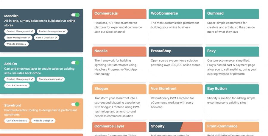
Last week, Snipcart was sponsoring Headless Commerce Summit, an event organized by Netlify. For a talk given by our CEO, François, we were trying to find a way to better visualize the differences between multiple headless e-commerce solutions. The opportunity was perfect for creating a Vue.js app and leveraging Tailwind CSS to make it visually appealing and easy to use quickly.
Psst: François just transformed his talk into a full dev guide to headless e-commerce.
Here’s the final look:

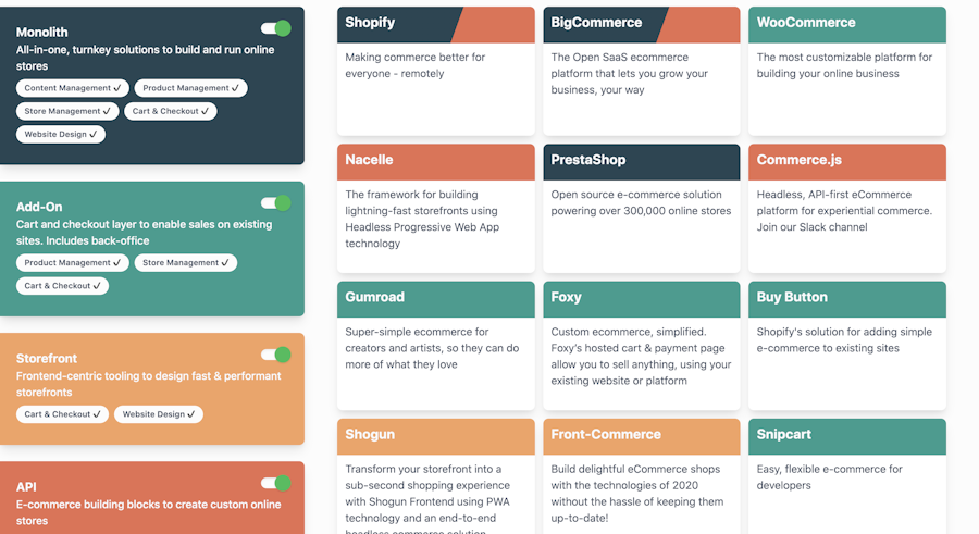
We’ll see how to get there in the tutorial!
I wanted to play with Vue 3 for a while now. This pet project was the perfect place to experience this new version, which is currently in release candidate—meaning the overall API isn’t subject to breaking changes.
1. Initial set up
Since Vue 3 is still “bleeding edge,” I wasn't sure where to start configuration-wise. I decided to fork a working demo with a proper webpack config directly from the Vue.js team here.
To do so, run the following command:
git clone git@github.com:vuejs/vue-next-webpack-preview.git your_project
cd your_project
npm install
Once it's done, hop in the cloning destination and install the following packages:
npm install tailwindcss
npm install postcss-loader
Then, fire up your favorite IDE and open the webpack config. The first thing to swap is the CSS test rule in your webpack.config.js file.
Replace the CSS rule in the modes.rules with the following object:
{
  test: /\.css$/,
  use: [
    {
      loader: MiniCssExtractPlugin.loader,
      options: { hmr: !env.prod }
    },
    'css-loader',
    'postcss-loader'
  ]
}
I’ve only added a postcss-loader entry. Then we will need to create postcss.config.js file directly at the root. In it, we will use the following config:
module.exports = {
  plugins: [
    require('tailwindcss'),
    require('autoprefixer'),
  ]
}
2. Playing with data
Now that you have the configs set up let’s create dummy data to play with Tailwind CSS.
First, create a src/data.js file where, in my case, I’ll put the information concerning different e-commerce solutions. The goal of this app was to be able to filter e-commerce solutions by their characteristics.
Here’s how to define this data:
 export default {
    "tags": ["Content Management", "Product Management", "Store Management", "Cart & Checkout", "Website Design"],
        "categories": [
        {
            name: "Monolith",
            description: "All-in-one, turnkey solutions to build and run online stores",
            tags: [0, 1, 2, 3, 4],
            color: "#264653"
        },
        {
            name: "Add-On",
            description: "Cart and checkout layer to enable sales on existing sites. Includes back-office",
            tags: [1, 2, 3],
            color: "#2a9d8f"
        },
        {
            name: "Storefront",
            description: "Frontend-centric tooling to design fast & performant storefronts",
            tags: [3, 4],
            color: "#f4a261"
        },
        {
            name: "API",
            description: "E-commerce building blocks to create custom online stores",
            tags: [1, 2],
            color: "#e76f51"
        }
    ],
    "entries": [
        {
            "name": "Shopify",
            "description": "Making commerce better for everyone - remotely",
            "cat": [0, 3]
        },
        {
            "name": "BigCommerce",
            "description": "The Open SaaS ecommerce platform that lets you grow your business, your way",
            "cat": [0, 3]
        },
        {
            "name": "Magento",
            "description": "Flexible eCommerce solutions, a vibrant extensions marketplace, and an open global ecosystem",
            "cat": [0, 3]
        },
        {
            "name": "PrestaShop",
            "description": "Open source e-commerce solution powering over 300,000 online stores",
            "cat": [0]
        },
        {
            "name": "Snipcart",
            "description": "Easy, flexible e-commerce for developers",
            "cat": [1]
        },
        {
            "name": "WooCommerce",
            "description": "The most customizable platform for building your online business",
            "cat": [1]
        },
        {
            "name": "Gumroad",
            "description": "Super-simple ecommerce for creators and artists, so they can do more of what they love",
            "cat": [1]
        },
        {
            "name": "Foxy",
            "description": "Custom ecommerce, simplified. Foxy’s hosted cart & payment page allow you to sell anything, using your existing website or platform",
            "cat": [1]
        },
        {
            "name": "Buy Button",
            "description": "Shopify's solution for adding simple e-commerce to existing sites",
            "cat": [1]
        },
        {
            "name": "Shogun",
            "description": "Transform your storefront into a sub-second shopping experience with Shogun Frontend using PWA technology and an end-to-end headless commerce solution",
            "cat": [2]
        },
        {
            "name": "Vue Storefront",
            "description": "Revolutionary PWA Frontend for eCommerce working with every backend",
            "cat": [2]
        },
        {
            "name": "Front-Commerce",
            "description": "Build delightful eCommerce shops with the technologies of 2020 without the hassle of keeping them up-to-date!",
            "cat": [2]
        },
        {
            "name": "Commerce.js",
            "description": "Headless, API-first eCommerce platform for experiential commerce. Join our Slack channel",
            "cat": [3]
        },
        {
            "name": "Commerce Layer",
            "description": "Headless Commerce for Global Brands",
            "cat": [3]
        },
        {
            "name": "Nacelle",
            "description": "The framework for building lightning-fast storefronts using Headless Progressive Web App technology",
            "cat": [3]
        }
    ]
}
What you want to do now is consume that data. It’ll be done in the src/App.vue.
The content is quite heavy so let’s check it part by part, beginning with the script section:
 <script>
import { ref, computed } from 'vue'
import dataset from './data'
export default {
  setup() {
    const categories = dataset.categories;
    const isToggled = ref(dataset.categories.map(x => true));

    const filters = computed(() =>
      isToggled.value
        .reduce((acc, curr, i) => curr ? [...acc, i] : acc, [])
    )

    const filteredEntries = computed(() =>
      dataset.entries
        .filter(entry => filters.value
          .some(filter => entry.cat.some(cat => cat === filter)))
        .sort(() => Math.random() - 0.5)
    )
    const getColorForCat = (cat) => {
      return cat.length === 1
        ? { backgroundColor: categories[cat[0]].color }
        : { background: `linear-gradient(110deg, ${categories[cat[0]].color} 60%, ${categories[cat[1]].color} 60%)` }
    }
    return {
      isToggled,
      categories,
      filteredEntries,
      labels: dataset.tags,
      getColorForCat
     }
  }
}
</script>
Setup is a new Vue 3 lifecycle method that returns an object to be used inside the component once it’s instantiated. You don’t have access to data nor props inside that function. That being said, I didn’t dive into the composition API and why the architecture is defined as such. From what I can understand, it makes it much easier to compose/reuse logic, similar to react hooks, if you come from this ecosystem.
The code is fairly straightforward; it’s a bunch of helper functions to help us filter entries based on if they are toggled or not.
An interesting Vue 3 related part is the ref function used in the isToggled declaration. It’s one of two ways to make the inner object reactive. You can read more about this here if you’re interested.
Let’s now check the style section, which is quite smaller:
<style>
@tailwind base;
@tailwind components;
@tailwind utilities;

.toggle__dot {
  top: -.25rem;
  left: -.25rem;
  transition: all 0.3s ease-in-out;
}
input:checked ~ .toggle__dot {
  transform: translateX(100%);
  background-color: #20bf55;
}
.bg-cus {
  background-color: #fcfcfc;
}
html {
  background-color: #fcfcfc;
}
</style>
I only define a little transition for the checked input that will serve as filters. That’s also where you include Tailwind primitives.
And now the template section containing the view of the component:
<template>
  <div id="main" class="flex flex-col items-center justify-center w-full mt-12 mb-12">
    <div class="flex w-full">
      <div class="flex w-1/3 flex-col">
        <div class="p-6 mb-6 rounded-r-lg shadow-lg" :style="{backgroundColor: color}" v-for="({name, description, color, tags}, index) in categories" :key=index>
          <label :for=name class="flex flex-col cursor-pointer">
            <div class="flex w-full justify-between">
              <div class="text-gray-100 font-bold text-lg">
                {{name}}
              </div>

              <div class="ml-3 relative">
                <input :id=name type="checkbox" checked class="hidden" @change="isToggled[index] = !isToggled[index]"/>
                <div class="toggle__line w-10 h-4 bg-cus rounded-full shadow-inner"></div>
                <div class="toggle__dot absolute w-6 h-6 bg-white rounded-full shadow inset-y-0 left-0"></div>
              </div>
            </div>
            <div class="text-gray-100 font-medium">
                  {{ description }}
            </div>
          </label>
            <div class="pt-2">
              <span v-for="tag in tags" :key="tag" class="op inline-block bg-cus rounded-full px-3 py-1 text-xs font-semibold text-gray-700 mr-2 mb-2">
                    {{labels[tag]}} ✔️
              </span>
        </div>
         </div>
      </div>
      <div class="w-2/3 ml-12 mr-12 grid grid-cols-3 grid-rows-5 gap-3">
        <div class="bg-white rounded-lg shadow-lg" v-for="({name, description, cat}) in filteredEntries" :key=name>
          <div>
            <div :style="getColorForCat(cat)" class="px-3 py-2 rounded-t-lg">
              <div class="font-bold text-xl text-gray-100 mb-2 mr-2">
                {{name}}
              </div>
            </div>
            <div class="px-3 py-2 rounded-t-lg">
              <p class="text-gray-700 text-base">
                {{description}}
              </p>
            </div>
          </div>
        </div>
      </div>
    </div>
  </div>
</template>
One thing that you need to get familiar with when working with Tailwind is the naming convention. It looks a little like BEM; you start with a property following by a “specifier” and some variant of it, joined together with a -. I know it’s not formal, but it helps seeing it as a kind of funnel that specifies an initial property.
Let’s take text-gray-100, for example. Well, text is the top property that relates to our text color in CSS. Then we want to use gray, specifically the “100” version of it. So, to use Tailwind, you have to get familiar with the different classes offered. The names come naturally, and it’s easy to find the proper names in the docs if you forgot/want to look at something.
For most of your tags, you’ll need to add multiple classes. This might seem tedious at first, but it comes naturally once you get familiar with them. The names also resemble their CSS counterparts very much, so it's not like you’ll have to learn a whole new jargon.
One of the mistakes I made at first was using too much custom CSS. It’s something you might be tempted to do since you won’t know all the classes at first, but keep in mind that it’ll be better in the long run if you search first to make sure it doesn’t exist. As it’s said in the docs, HTML is easier to maintain than CSS.
You can also use the @apply directive to make the template lighter and combine Tailwind classes into such as:
.btn-blue {
  @apply bg-blue-500 text-white;
}
The classes are also very well-built; they’re minimal, so composing them together should be your go-to. Everything that concerns the “structure” of your app—flex, grid display, responsiveness, size, etc., should be defined with Tailwind.
Declare highly custom classes only when you need to (such as the switch in this example.)
3. Pushing the configuration further
Until now, I presented a pretty basic Tailwind config. However, Tailwind offers much more customization capabilities to dig deeper.
To do so, you can create a tailwind.config.js file directly in the root. It’s quite a good idea to centralize such global config. If you’re like me, your CSS turns messy overnight. Let’s avoid that!
Here’s a custom configuration from Tailwind’s site:
module.exports = {
  theme: {
   screens: {
      sm: '640px',
      md: '768px',
      lg: '1024px',
      xl: '1280px',
    },
    colors: {
      transparent: 'transparent',
      black: '#000',
      white: '#fff',
      gray: {
        100: '#f7fafc',
        // ...
        900: '#1a202c',
      },
    }
    fontFamily: {
      display: ['Gilroy', 'sans-serif'],
      body: ['Graphik', 'sans-serif'],
    },
    borderWidth: {
      '0': '0',
      default: '1px',
      '2': '2px',
      '4': '4px',
    },
    extend: {
      colors: {
        cyan: '#9cdbff',
        purple: {
          light: '#d05ce3',
          default: '#9c27b0',
          dark: '#6a0080',
        }
      },
      spacing: {
        '96': '24rem',
        '128': '32rem',
      }
    }
  }
}
Any section is optional and will default to the default config, which you can see entirely here:
There is pretty advanced config in there that I doubt you’ll need to touch, but there’s also useful stuff that might come handy. It’s all well documented in Tailwind’s docs, but I thought highlighting some concepts might save you some time.
The first is the screens section. It’s where you set the responsive breakpoints of your project, which means that all the classes that are linked to responsiveness will be triggered according to these exact breakpoints.
Another cool section is the color scheme. This lets you override the default mapping to the color palette. Remember when I used text-gray-100? Well, let’s say you wanted to re-scale the whole palette without losing the nomenclature. You could rewrite it there instead of using custom colors directly in your files and losing the ability to reuse your CSS, but more importantly, abandoning the benefit of using uniformity in your naming convention.
As you can see a little lower in the extend part of the config, you can not only override default colors, but spin off your own colors. Like the default ones, these colors can be nested to “scale” them—like the indigo one in the custom config.
All these colors will automatically be used in the text, border, and background. Hence, you could use the darker indigo as text color with .text-purple-dark.
You can customize many more elements, like spacing/sizing scales, border widths, font-families, etc. However, the last point I want to touch - a bit more advanced, but interesting - is that you can write your own plugin. It lets your register new styles to Tailwind by using a programmatic interface instead of CSS.
This can be interesting if you want to parameterize some parts of your style sheet to generate it directly in JS. It's much more convenient than going through an asset-managing/file pipeline. It lets you add utilities, components, base style, and variants.
Live demo & Github repo

Try the live demo here
See GitHub repo here
Closing thoughts
I really enjoyed working on this. The documentation for Tailwind is spot-on and even if it’s somewhat new, there’s a lot of helpful content online.
I would be curious by the results of building a full-blown project with Tailwind CSS. I fear that using a lot of classes in your templates might feel too heavy at some point. Even if you can use things like @apply, I feel like this could get a little messy. If you’ve done it, I’d like to read your opinion on it in the comments!
I spent roughly 4-5 hours on this small project. I had some weird issues with PostCSS and webpack at some point. I might also have wandered too much in Vue 3 docs for the sheer pleasure of it. ¯_(ツ)_/¯
I would really like to create a plugin at some point. I think that the potential issue I just raised might be answered by developing more complex “compound” component classes building on top of their primitives? It might also be a bad idea. I would like to figure that out, though, as I think this is potentially really powerful. Again, comments?
If you've enjoyed this post, please take a second to share it on Twitter. Got comments, questions? Hit the section below!


