How to Design an E-Commerce Website: From Homepage to Checkout
This comprehensive guide shows how to design your e-commerce website with real-life examples. From homepage to checkout, learn the best design practices to craft online stores that convert.
Part 1
Why a Thoughtful E-Commerce Design is Essential
You’ve decided to launch a new e-commerce business. Scary, but exciting times!
You’ve got killer products, settled on affordable prices—you even started to work on a whole new website to showcase your goods and start selling online. It seems like nothing stands between you and immediate success, right?


Not so fast—the next step in your process can make or break your new project. That is: designing your e-commerce website.
Just as we’ve already explored with the e-commerce checkout flow, a poorly designed shopping experience can (and will) force users to leave and find a better experience elsewhere. While in the first resource we focused on the checkout part of it, here we’ll find out how the whole design of your website can impact sales.
But more importantly, we’ll figure out what are the best practices so that you can find your way through this challenging task.
The e-commerce landscape has changed a lot in the last 5 years. First, the quantity of online transactions has exploded—retail e-commerce sales worldwide have gone from 1.3 trillion dollars in 2014 to a projected 4.1 trillion dollars in 2019. This has lead to an inevitable race to the greatest UX. Trust me, in this crowded landscape, you don’t want to be trailing behind.
A time before e-commerce...
To further understand the importance of great e-commerce design, let’s make a parallel with the physical world.
Remember when Apple came up with the first Apple Store back in the early 00’s? It completely transformed the way we, as customers, shop. It did so thanks to two major improvements to traditional shopping experiences:
Apple Stores looked amazing. Their sleek design, bright colors and large open spaces make for venues where you want to hang out, even if you have no intention of buying anything (you might eventually though).
They became an unavoidable stop in any trip to the mall. They brought many new features to enhance user experience--a bunch of tech-savvy employees on duty at all times, comfy product testing areas, the Genius Bar, etc. It was something never seen before.

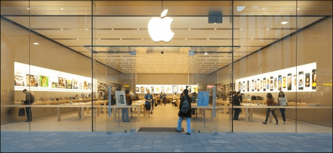
We can’t emphasize enough the huge impact these stores had on the retail world. Take a good look around next time you enter a shopping center; every shop looks, in some capacity, like an Apple Store—bright colors, refined design and large spaces that breathe.
Many other companies, in several domains, are trying to push the limitations of shopping UX to new heights—look at Amazon & Tesla, just to name a couple.
If an outstanding shopping experience is now a key element to the success of physical stores, it fully translates to the digital world as well. Maybe even more so, because, you know, it’s way easier for users to quit a lousy online experience.
It’s estimated that e-commerce sales will account for 17.5% of total global sales in 2021, which means the offer is on the rise. Standing out with a good looking website and a seamless shopping experience will go a long way in this new digital reality.
What you want with your e-commerce website is to engage customers. And design is a significant part of succeeding in this task.
1.1 User engagement
An e-commerce site is primarily built for customers to shop. Your design should make it seamless for them to do so. It has to be intuitive and easy to use if you want to make more sales.
To reach next level user engagement, there are a few concepts you should keep in mind at all times while designing your website.
Simplicity - A user entering your website for the first time should never have to ask her/himself: “Okay, what’s the next step?” A confusion-inducing UI is your worst enemy here.
We’ll see later on how you can make each step of the shopping experience more pleasurable for customers.
Coherence - You want your design to be coherent with what you’re selling in the overall feel and look. If you’re doing this right, better are the chances for engaging with an audience that is looking for the kind of products you’re offering.
Picture this: your very serious dad is shopping online for a brand new luxury car. He opens up a website that is full of bright colors; a massive clash with the sober, luxurious product he’s looking for. In a second or two, he’s out, back in the digital jungle.

Colors, images, fonts, everything should match. To be able to get there, you first need to know your product, obviously, but also your target audience.
Trustworthiness - The website needs to inspire trust to potential customers. A design that looks professional will instantly erase most doubts a user could have when getting to the checkout process.
Put yourself in your customers’ shoes: would you give personal and payment information to a shady-looking website? Probably not.
Transparency - Quickly enough, newcomers to your business will want to know who you are and how you operate. Make sure that contact info and policies for shipping and returns are easy to find.
Mobile-friendly - This is no secret: your e-commerce website NEEDS to be responsive.

Why? Here are a few striking statistics:
79% of smartphone owners have used it to make a purchase online in 2018.
40% of all e-commerce purchases during the 2018 holidays were made on a mobile device.
80% of shoppers have used a smartphone inside a physical store to either look up product reviews or compare prices.
So yeah, people shop on their phones a lot, which in itself is a great reason to build a mobile-friendly shopping UX.
But you also have to know that a responsive website is one of the major ranking signals in Search Engine Optimization (SEO) since Google has rolled out mobile-first indexing. SEO is not something to disregard when it comes to customer acquisition, so this makes responsiveness mandatory to any successful e-commerce website.
We’ll explore mobile-specific design throughout the rest of this guide.
1.2 Optimizing your sales funnel
A great e-commerce website should allow you to take a new customer who doesn’t know anything about you, all the way to buying your product(s).
Here’s a typical online store infrastructure:

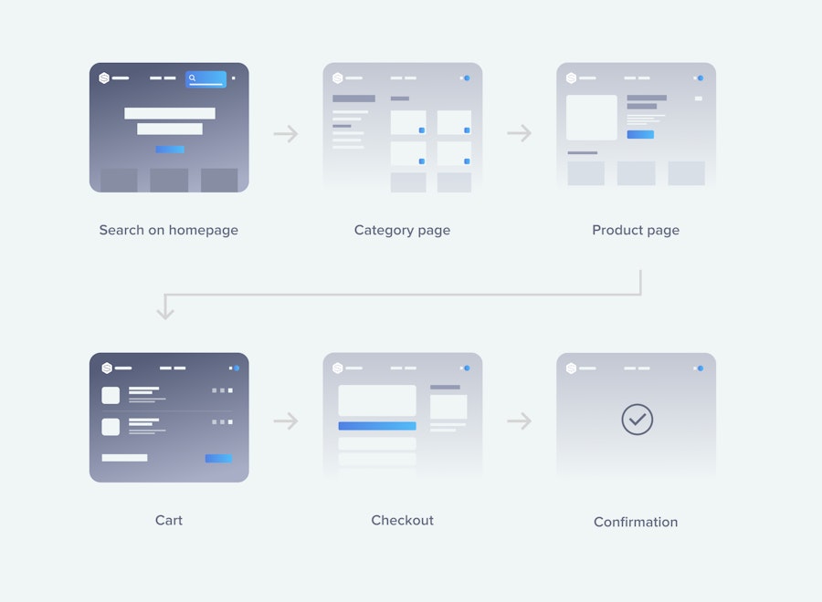
Each new step leads your customer closer to conversion, which in this case represents the purchase of an item. Your goal, as the website designer, is to lower the psychological barriers between each of these steps as much as possible. You want to ease the passage of a user from one step to the next.
I’ll break these steps down with the design needs you should consider for each of these pages.
Part 2
Site-Wide Design Tips
In the next sections, I’ll go down the e-commerce sales funnel and teach you how your design should guide users through it.
It’s important to keep in mind that there isn’t a single way to build a great e-commerce website. What follows are recommendations and things that should appear on it. You can include these elements however you want; go crazy with it! Be creative in the way you create a unique experience that fits your brand.
Some of the following elements depend on whether you’re selling a single product vs. multiple products. Obviously, architectures aren’t exactly the same in both cases. A site with thousands of pages is going to have significantly different systems in place to keep everything consistent and organized than a site with only a few pages.
Still, here are a few concepts that apply for online stores of any size.
Some site-wide design elements are expected of any e-commerce website. Some of these help with general navigation and ensure it’s easy to get back to shopping, no matter where you find yourself on the site. Others are present to show potential customers that they can trust you.
2.1 Navigation
An intuitive navigation is the first step to a pleasant shopping experience. Remember that it’s all about finding products easily and having the necessary info at hand, at all times.
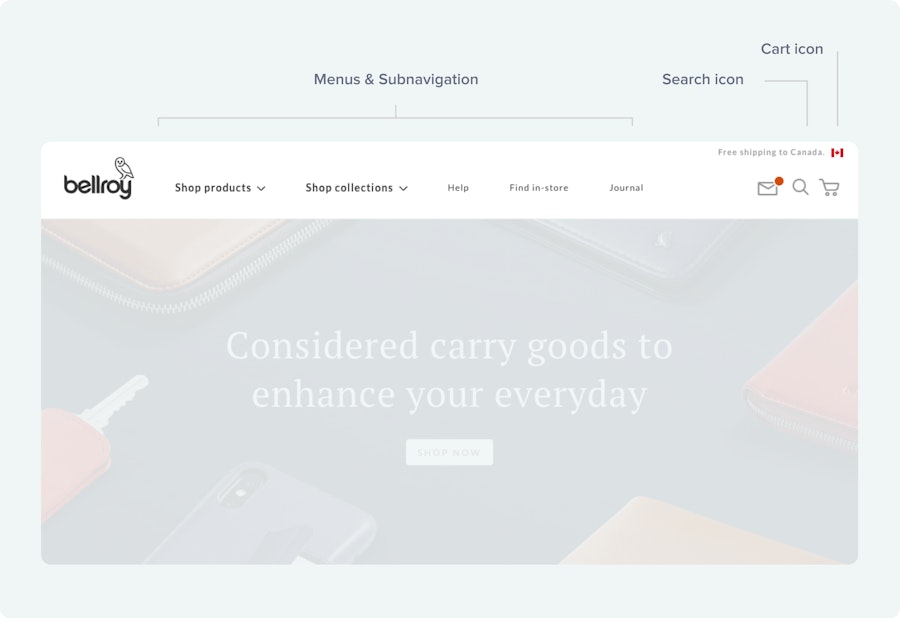
- Menus
Use drop-downs with sub-menu items depending on how many different kinds of products you sell. For clarity, use general terms to segment product items.
- Prominent search bar visible on every page
Here’s a case of something relevant only if your site has a lot of products. Otherwise, it’s only noise. But when applicable, it will help users find exactly what they are looking for, more quickly. They should be able to browse by product categories as well as specific products.
- Cart icon
Not only should it be available from every page on your site, but the icon should also show how many items have been added at any time. Clicking the icon allows users to go back to the cart and access checkout. You could even push it further by enabling a cart preview when a user hovers over the icon. For a single-product website, you might also want to repeat your call-to-action on each page or, at least, on most of them.

2.2 Building confidence
- Show known & trusted logos.
Once again, this is not always applicable, but if your website sells big brand names, then you should show it, wherever possible. These logos will add prestige to your business for being affiliated with industry leaders. It also triggers an important user engagement signal I mentioned earlier: trust.
- Customer testimonials
It’s human behavior to seek social proof. It’s a particularly strong concept in e-commerce. You don’t have to wait for a user to land on a product page to show them testimonials praising your services. Customer testimonials can be found on most pages, generally in the footer as to not interfere with the core content.
- Contact & necessary business info
Also found in the footer of every page of your website, is any info necessary to answer main users’ concerns. First & foremost, you want to reveal your contact info clearly. It’s essential that customers feel like it’s easy to join you and that you’re transparent in your communication channels. Other things you should consider adding as links to your footer:
“About Us” section—let your customers know more about your business and the members of your team. Always good to create a human connection in this digital landscape.
Privacy policy
Return policy
Delivery information
2.3 Quick word on accessibility
Accessibility is all the rage nowadays, and for good reasons. If we want to make the web a place where anyone can roam without limitations, it’s important to contribute as much as possible.
The least you can do is to support color blind people. Here are some cool resources to do so:
Now that we've covered what should be found site-wide, let's go more specific.
Part 3
The First Impression: Homepage Design
Like the first seconds of a blind date, the homepage is your first chance to make a good impression, so don’t waste it. It’s the place to sell your brand to newcomers. These new visitors should be able to understand the core of your business in a matter of seconds.
But you don’t want to throw them too quickly into a product frenzy either. In fact, let's just make a blanket rule here: do not make your homepage a product listing.
So what should your homepage consist of?
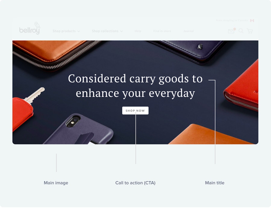
- Eye-catching title
A well-structured phrase that encompasses what your product(s) is about can go a long way in grabbing users’ attention. It’s also the place where you can put any sale or promotion forward.
- Prominent call-to-action
Your title should be followed by a CTA that is relevant to the product(s) you sell. Find a formulation that is close to your brand identity. Pass on any CTAs which are too boring or just generic.
- Pictures that capture your products in use
Do I need to specify professional photography here? High-quality pictures show professionalism and inspire trust in customers’ mind. A picture’s worth a thousand words and, since online shoppers never have the time for a thousand words, give them pictures, lots of them.
- Include best sellers of featured product
Your homepage shouldn’t be a product listing but that doesn’t mean you can’t feature your best items on it. Think of it this way: what are the products you would showcase in your window if you had a physical shop? They can be either best sellers or featured products for specific holidays, events or seasons.

3.1 E-commerce homepage design examples

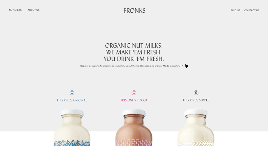
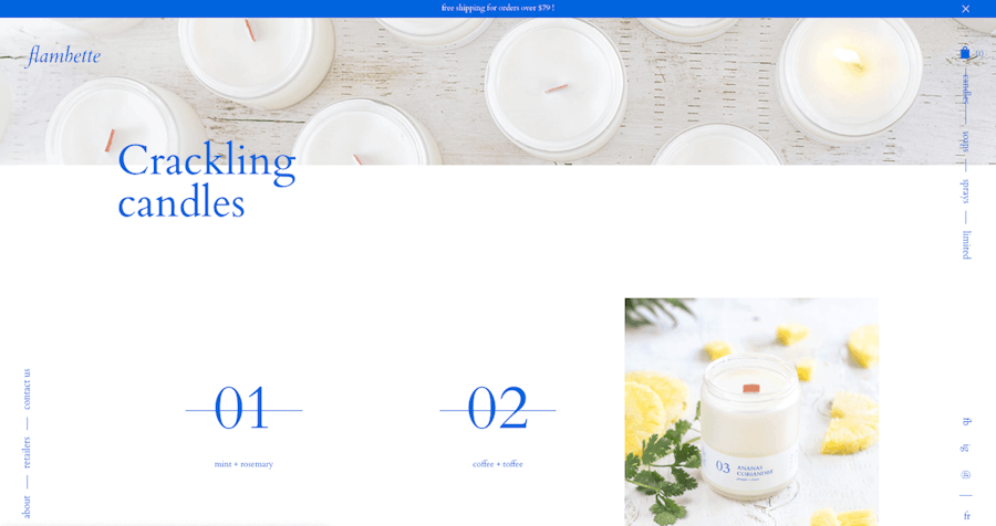
Simple and effective. This website sells three products, all displayed on the homepage in an original and joyful way. Everything’s there, in a quick glance.

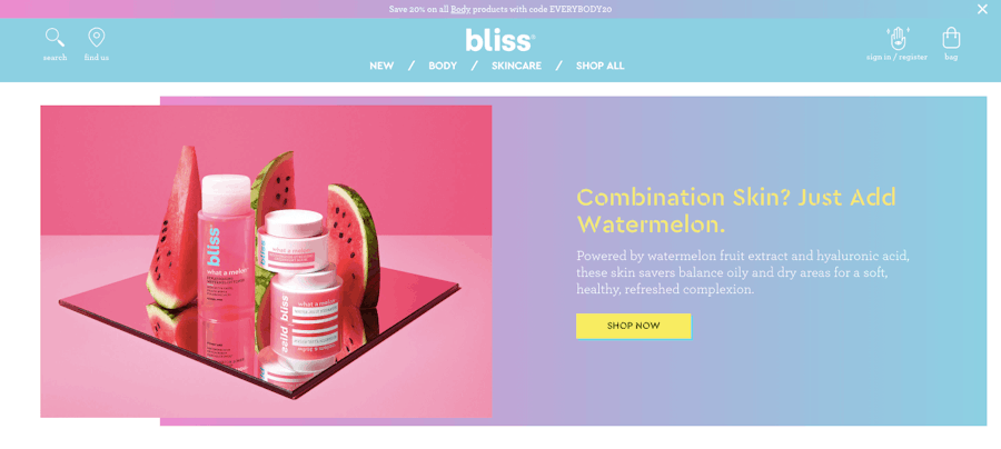
Talk about personality, right? No doubt that the designers here know exactly who they are talking to. The pictures are eye-catching and professional.

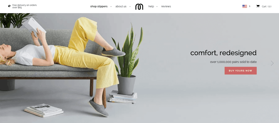
This homepage is successful in creating a mood. The pictures exude comfort, which is the feature that is put forward in the titles as well. The message couldn’t be clearer.
Part 4
Shopping Time: Listing Page Design
Users generally get to a listing (or catalogue) page through the search bar or by selecting a product category via the navigation. It also means: they are starting to get curious. That’s where they’ll find a listing of every product associated with the category closer to their present need.
Of course, if you only sell a few products, it might not be necessary to break them down into categories. In that case, the listing page will include all the items you sell.
Here are some design tips you should try to include in these types of pages:
- Category introduction
A short introduction to your catalogue page might help customers know immediately if they are at the right place to find what they are looking for. You can’t afford to make them waste time searching unsuccessfully, so be clear and transparent in your category introduction.
- Enable filtering and sorting functions
Once again, it’s all in the final goal of simplifying customers’ lives when looking for a specific product. Even inside a single category, you should enable filtering and sorting. The more products available, the more important this aspect is. Don’t hesitate to throw in multiple sorting variables such as colors, price range, sizes, brands, etc.
There’s a saying in UX development: “more options, more problems.” There’s a sweet spot to reach between too many filters and not enough. Keep in mind that filters are there to assist, but the page doesn’t have to depend on them. Also, in case there’s no result for the filters applied, don’t just show users a blank page saying: “Sorry ¯_(ツ)_/¯.”
Use this opportunity by keeping the customer on the site and try something else.
- Highlight best sellers & reviews
You’re given another occasion to showcase your best products here, so jump on it! Highlight the products you know your customers love by placing them higher on the listing or by giving them their own featured spot. Plus, why not have product review scores appear next to each item on your catalogue page? Social proof is a strong, enticing force when it comes to buying online; here’s a good opportunity to benefit from it.
- Show stock availability
This one’s more of a preventative measure. In case an item is out of stock, you don’t want customers to find out at the last moment or at checkout. Showing them right away on the listing page will help you avoid customer frustration down the road. Plus, in cases of limited releases or quantities, it can be an excellent incentive to buy quickly.

One more question to ask yourself when designing your listing page: “Should I list my products in grid view or list view?” Well, know that there isn’t a straight answer, but that both serve different purposes.
A list view is better suited for products that need longer descriptions and extensive information. These might be technical or high-end products.
A grid view on the other end is a good fit for products that require more of a visual presentation, without much description. This format also allows for quick side-to-side products comparison.
AB Tasty has a great resource on how to optimize your product listing pages, in case you want to know more.
4.1 Listing page design examples

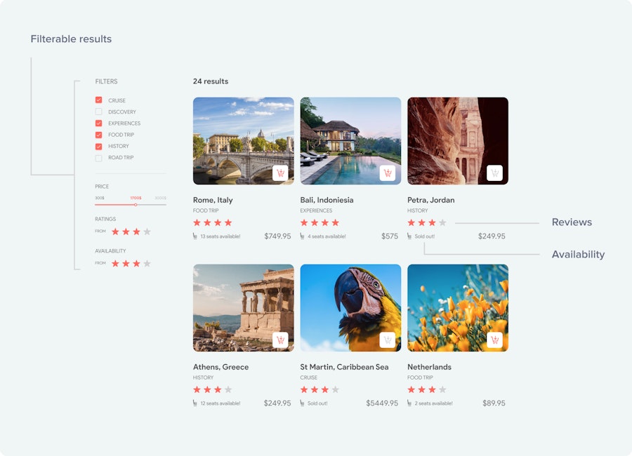
I use this website example again because everything’s there. Category introduction, intuitive navigation, great images, product reviews, sorting filters and even a “quick view” options that opens up a modal with more product info. It checks all the boxes.

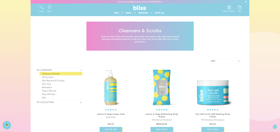
Here’s an example of a listing page that breaks the rule to a great effect. The animated pictures are a great choice for products that are better described by a mood than words, like candles. Huge bonus when it’s well done like it is here.
Part 5
Getting Close: Product Page Design
Everything’s going so well; you’ve walked potential customers all the way down to an individual product page. The buy button is right there, in their face, the sale is so close… yet so far. Many, many things can still go wrong here. This is where the hardest psychological barrier to overcome appears—buying a product that you can’t see physically, touch or try out.
To ease that passage to the next step, this page needs to be as close as a real shopping experience as possible. This means photos, descriptions and specifications should be detailed enough so a customer feels confident to put his money on it and get what he’s paying for.
Here are the essential elements of a product page and how they should be correctly designed:
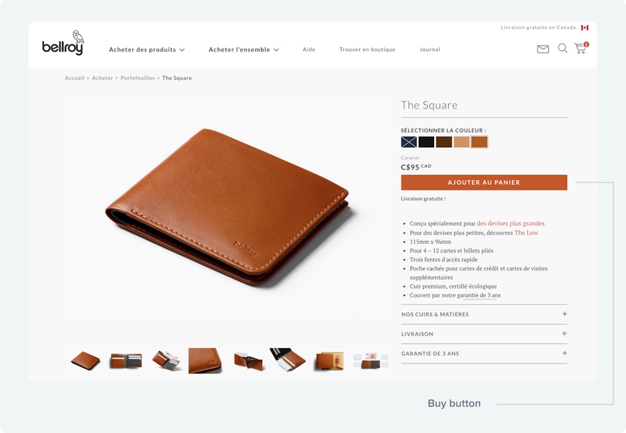
5.1 The “add to cart” button
This is the centrepiece of your product page. I mean, it’s your money-maker, a necessary step to an upcoming transaction. A buy button might look like a pretty simple element to design, but there’s such a thing as a bad buy button. A crucial element such as this deserves your careful attention.
A great buy button should:
Be prominently displayed. It should be placed in the most obvious place possible. Captain obvious you’ll call me, right? But it’s important to point out that it’s not the moment to get creative here. The exact placement will depend on any unique design, but it should be right there, at customers’ reach, at all times. To achieve this, it has to be placed above the fold.
Also, let it breathe. In order for it to stand out, don’t cram up too many elements around it. Whitespace is your friend here. Another good practice is to duplicate your buy button and to place it at the bottom of the page as well. Consequently, a customer that scrolls down the entire page is still invited to take action at the bottom of it.
Be contrasted. Once again, it’s all about standing out. It might be counterintuitive, but it’s preferable to use a color that isn’t used anywhere else on the page. Be careful though; you still want a color that looks good with your color scheme, but different than what’s already there.
Be BIG. This one doesn’t need much explaining. Make your button big enough to pop out of the page at first glance. If your buy button needs a few seconds to be found on the page, it should be a huge red flag.
Look like a button. It might sound funny, but for people to click on your buy button, it must look “clickable.” Consequently, you don’t want to design something too flashy. Customers are used to buy buttons looking a certain way, so stick to what they know. Extra elements like a shopping cart icon on an “add-to-cart” button or a down arrow for a download button can help emphasize the purpose of the button.
The baseline here is: make your buy button stand out.

5.2 Images
Images are your best chance to demonstrate your product to potential customers. People want to know (and SEE) what they’re buying. Show them. The goal here is to make the experience as tangible as possible for a digital platform. There are a few ways to achieve this:
→ Use professionally crafted pictures from different angles. Every significant feature of your product should be represented visually, so use as many angles as needed to do that. Also, try to show the product being used.
→ Use interactive ways to display images. A photo slideshow with a zoom-in feature is an example of convenient user experience when it comes to images.
→ Make them big! Remember: people want to see what they’re buying.
→ Video demonstrations are becoming really popular. If your product is harder to sell only with images, you should strongly consider it.
5.3 Product descriptions
Your product description is the place to dive with more details about what you’re selling. It should answer as many questions as it possibly can.
You want the description to be detailed, but maybe not at first glance. A good practice is to have a summary next to the product and buy button with a longer description down below, OR a “read more” link that opens up a modal window with in-depth details.
Some products need a lot of information & specs. Think of high-end purchases like technical devices or cars. In these cases use tabs to keep the info neat and tidy.
5.4 Other cool design tips for product pages
→ Highlight related articles or “You may also like” section. You have a great upsell opportunity here, make it an important part of your product page. To be effective, make sure that the suggested products are relevant. Otherwise, it’s only noise.
→ If your website has user accounts, a “add to wishlist” button is a cool addition. It gives the opportunity to put aside items that customers will then come back to later.
→ Show the estimated delivery time on the product page. Don’t leave your customers in the dark when it comes to this.
→ Display customer reviews & testimonials at the bottom of the page. It helps customers make their mind about the product. Plus, if you correctly implement the schema markup here, it can also give you an edge with search engine results thanks to review snippets.
→ For the same reasons as for the catalogue page, show stock availability.
5.5 Product page design examples
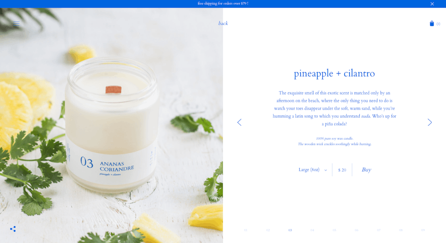
This website again goes for mood & personality first. The product is well represented through beautiful images—you can almost smell the candles. The buy button and CTA could be more prominent though.
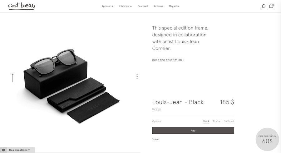
A simple product page example that includes everything you need: drop-down menu for longer description, images slideshow, product options and even CTAs for free shipping.
Part 6
Closing the Deal: Shopping Cart & Checkout Design
We’re now getting close to that conversion you’ve been working so hard to get. The only thing that can make a difference between a completed order and an abandoned cart is a painful checkout process. And trust me, it can get pretty painful.
Fortunately, we’ve got a complete resource covering everything you need to know to craft a seamless e-commerce checkout. So, I’ll go over this part quickly, covering the most important details, starting at the cart level.
First, how do you make the cart pop out? There’s no single answer here.
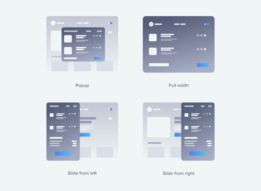
Full page, centred modal, sliding in from the side; choose the one that feels the most organic to your specific use case. The important thing is that opening the cart shouldn’t feel like a break in the shopping experience. It should be easy to have a look at the content of the cart quickly and then go back to shopping if needed.
If the cart’s empty: Only writing that the cart’s empty is a wasted opportunity. Invite users to add products with a call-to-action or shopping instructions. You can even include product suggestions.
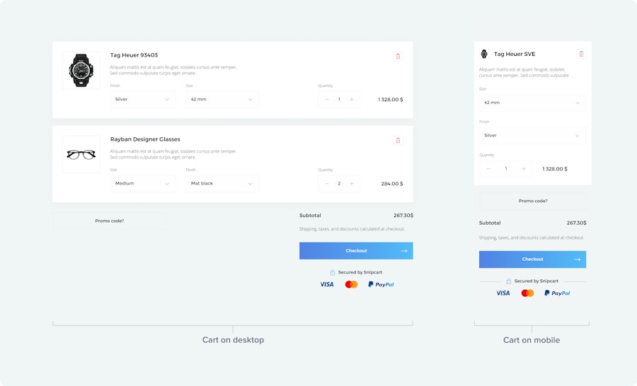
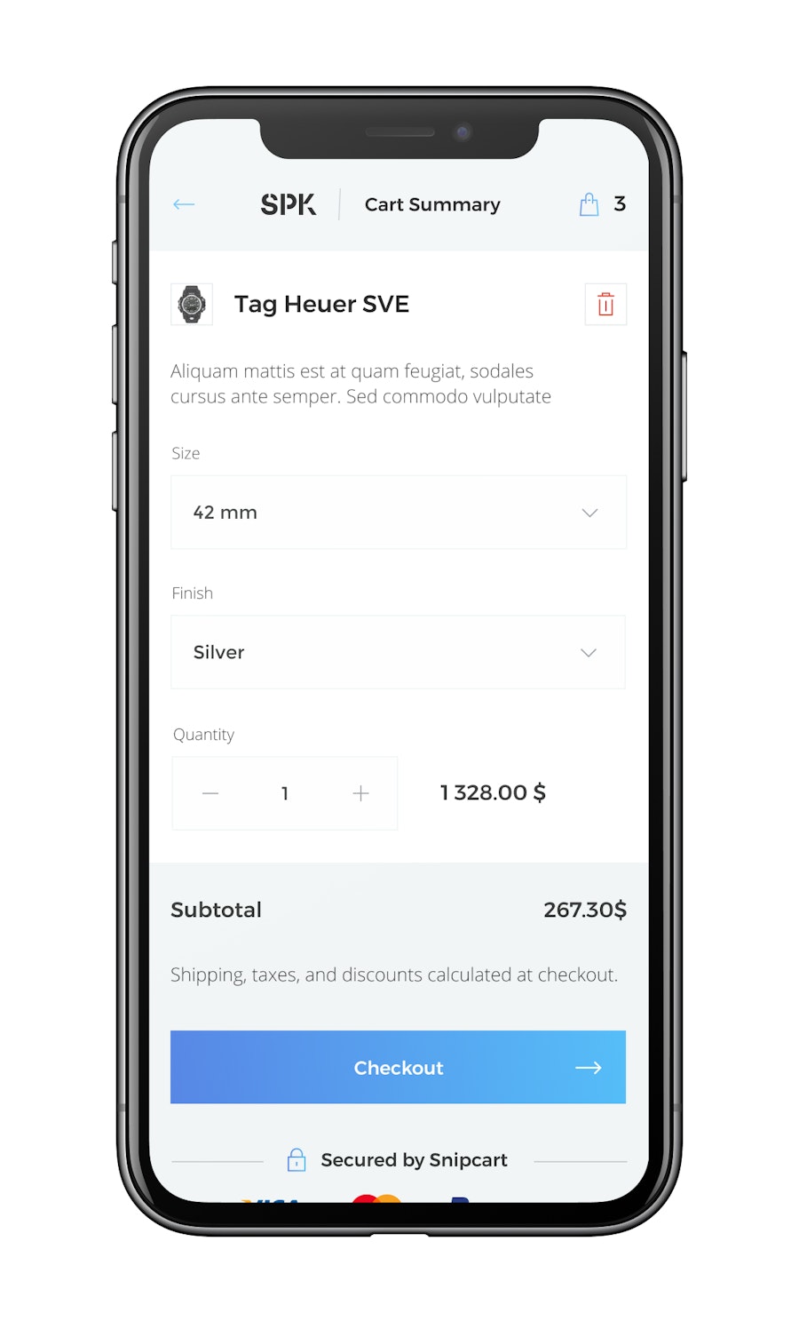
If there are products in the cart: Users should quickly see these elements presented in a clear, organized way:
Product inventory (with pictures & short descriptions)
Product quantity
Product options (with custom fields)
Individual price
Total price
I need to bring back the responsiveness talk here. I’ve already mentioned that your whole website should be optimized for mobile, but it’s particularly crucial when it comes to the shopping cart. Why? While mobile sales should account for around 52% of all e-commerce sales by 2021, the average mobile shopping cart abandonment rate is still incredibly high. We’re talking 85% high.
Yeah, it’s worth putting a lot of work into making your mobile checkout flow just as smoothly as your desktop’s checkout (if not better!). Today, pretty much any shopping cart solution you’ll use offers responsive cart design. In case you want to customize it or start from scratch, there are a few elements that you should keep in mind while designing your mobile UX:
Use a prominent CTA (“Checkout” or “Complete Order”) at the top of the page that doesn’t move as the user scrolls down. This way, it always stays visible and ready to be clicked.
The main difference between a desktop and mobile checkout essentially boils down to text and button size. Fingers are way less precise than a mouse, so you want clear & easy-to-tap buttons for all actions, from decreasing a product amount to advancing to checkout and hiding the cart.

6.1 Checkout
Then comes the checkout. Once again, I’ll refer you to our complete resource on the matter, but here’s a TL;DR:
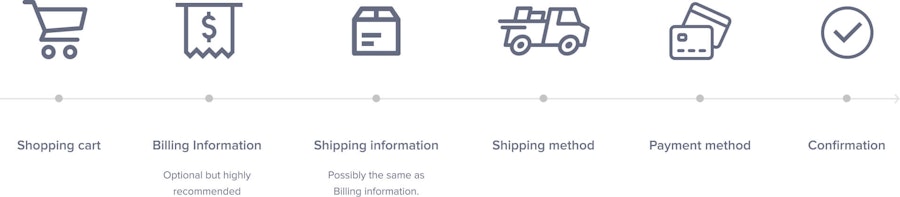
The standard checkout flow goes like this:
Shopping cart
Billing information (optional: depends on the merchant)
Shipping information (possibly the same as Billing information)
Shipping method
Payment method
Confirmation

This will change if you’re selling digital products where the shipping-related steps aren’t needed.
→ Give the option to check out as a guest. Registering for an account can be a major turn-off, don’t push your luck here.
→ Don’t ask for too much or unnecessary information. Do you really need the company name? The street address 2 field? Even their phone number? If not, scratch it. The simpler, the better.

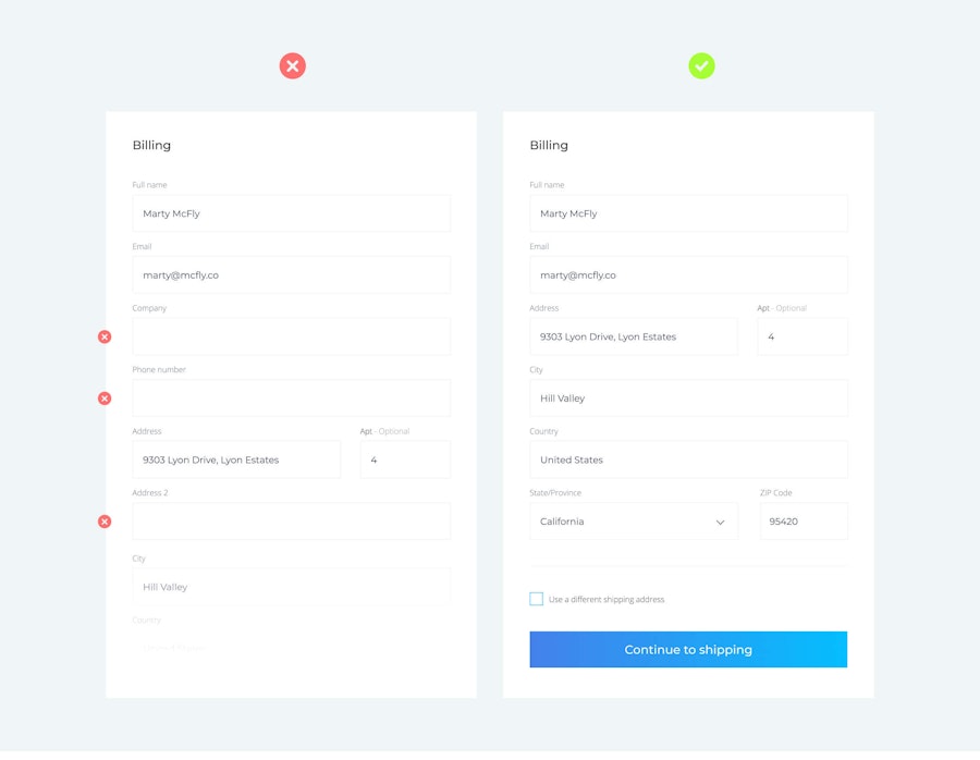
→ Use a single column layout. For two reasons: 1) It’ll be easier to have a mobile-first design this way, with the new mobile devices the web has become vertical. 2) Our eyes naturally scan from top to bottom on a single line.
→ Use visual constraints. If some fields can be shortened or merged together, do it!
→ Use masks instead of placeholders when possible. E.g., DD/MM/YYYY for the date, +1 (___)- for the phone number, or MM/YY for an expiry date.
→ Use inline validation after information input. Real-time feedback like a green check mark that lets users know they’ve filled out the field correctly.
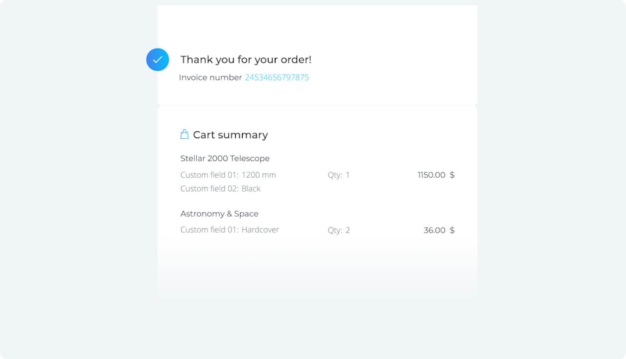
→ Include order confirmation after purchase. Write a “thank you” note that clearly informs them how they’ll receive their order summary or any other details that might be needed.

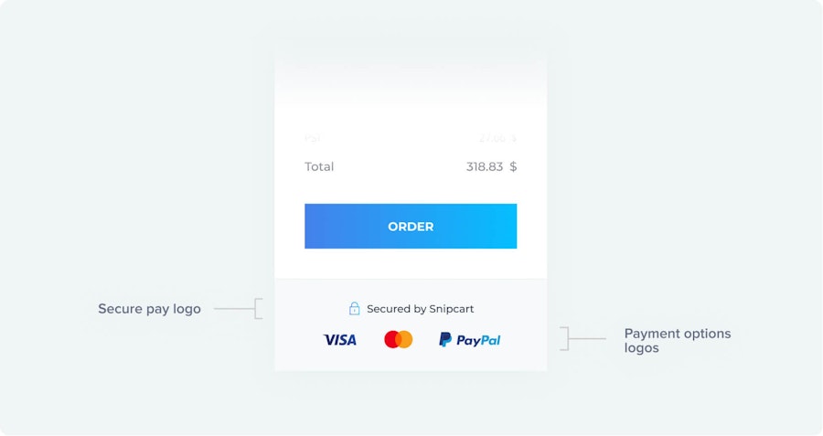
→ Show all payment options at checkout. Accepting PayPal? Apple Pay? Bitpay? All the logos should be added directly to the shopping cart, so users know what to expect.
→ Show customers that your site is secure. Other than the obvious HTTPS certificate, include a link in your cart that lets curious users read a more in-depth explanation of how security is handled.

Part 7
Closing Thoughts
I’ll close this on a disclaimer: Design is not an exact science, neither is this guide.
Even if you read fifty good practices articles on the subject, no one knows your product and your target audience as well as yourself. It might be totally unique, calling for unique design choices.
You have to test things.
That’s why having good analytics is so important. You have to listen to what the metrics are telling you and be ready to change your design as much as needed to improve these numbers. A green button converts better than a red one? Adjust. Black and white pictures bring more conversions? Adjust. A large header on homepage increases bounce rate? Adjust.
Design is always here to assist greater needs. It's the direct translation of how you communicate to your users to basically give them precisely what they need and expect.


